How to Create a Restaurant Logo that Builds Brand Identity
Last Updated: June 17, 2026
Your restaurant logo is more than a design; it’s a shortcut to recognition.
Studies show that it only took people 10 seconds to form a first impression of a brand’s logo (Design Rush, 2026).
That very first glance can either build trust and curiosity or leave your brand invisible in a crowded market.
So, even before a customer opens the menu, a strong logo communicates your restaurant’s vibe, quality, and promise.
This article shows you how to create a logo that speaks directly to your customers and reflects your restaurant’s identity.
Why does a strong logo for your restaurant matter?
A logo is not simply a visual representation. It serves as a strategic asset that conveys your restaurant themes and brand identity, establishes trust, and fosters customer loyalty.
Research conducted by UCT (Asia) found that 75% to 93% of customers evaluate a brand through its logo, highlighting its critical role in shaping customer perceptions and influencing dining decisions.
For instance, Shake Shack’s green burger icon signals its dedication to fresh ingredients, community involvement, and responsible sourcing.
Customers who value sustainability and high-quality ingredients can instantly recognize these qualities through the logo, which builds trust and encourages repeat visits.
In short, a logo is a silent ambassador of your brand.

How to make a restaurant logo that fits your brand
Below are easy steps on how to create a logo for your restaurant:
1. Define your restaurant brand first
Before any logo design begins, clarify what your restaurant stands for.
Consider:
- Cuisine
- Brand personality
- Target audience
- Emotion and experience
Example:
“I want to offer Japanese dishes in a fun and light ambiance, tailored for anime lovers, where they can play card games, socialize, and buy themed merchandise.”
This clear definition will guide your logo and restaurant branding so that it communicates your restaurant’s essence effectively to your customers.
2. Study successful logos
Examine popular restaurant brands and see what makes their logos effective.
One way this approach can be useful is through a Venn-style analysis.
For example:
By evaluating these fast food logos, it’s clear that every element, from color psychology and typography to symbols and brand message, is carefully aligned to create a cohesive identity.
This analysis helps you understand why certain colors and symbols are chosen and what they communicate about the brand.
3. Choose the right logo style
When it comes to logos, there are typically four primary types:
Wordmark logos
These logos use the restaurant name itself as the main design element.
Examples:
- Subway
- Five Guys
- Sweetgreen
- Shake Shack
- Whataburger
Icon + text logos
These logos combine a visual symbol with the restaurant name.
Example:
- McDonald's (Golden arches and text)
- Starbucks (Siren and text)
- Domino's Pizza (Domino tile and text)
- Chipotle Mexican Grill (Pepper icon and text)
- Panda Express (Panda logo and text)
Emblem logos
These logos place the restaurant name inside a badge, seal, or enclosed design.
Example:
- Burger King (name inside bun shape)
- Hard Rock Cafe (text inside circle badge)
- Tim Hortons (script text inside emblem)
- Dairy Queen (DQ badge style)
Mascot
Mascot logos feature a character that represents the brand.
Example:
- KFC (Colonel Sanders)
- Wendy's (Wendy’s character)
- Jollibee (Bee mascot)
- Popeyes (Popeye-inspired character branding)
- Chuck E. Cheese (Mouse mascot)
When choosing a logo style, always consider your target demographics and how it will be more engaging for them.
For example, Jollibee uses a bee mascot to appeal to children, which makes the brand more approachable and memorable for families.
4. Pick the right colors
According to Stockimg.AI, an AI-powered logo generator, several colors are commonly used in the food industry:
Common restaurant color choices

Popular color combinations for restaurant branding
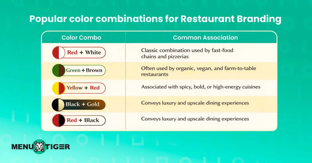
Note:Limit your logo to two or three main colors. Too many colors can make the design look cluttered and harder for customers to remember.
5. Select the right font
Typography plays a crucial role in logos because it affects how customers interpret your brand.
Common font styles include:
- Serif fonts (Elegant restaurants)
- Sans-serif fonts (Modern casual dining)
- Script fonts (Cafés and bakeries)
- Bold display fonts (Street food brands)
Your font should complement the logo’s graphic elements. It must also remain readable from a distance, scalable for menus and signage, and distinctive enough to represent your brand identity.
6. Create the logo
There are multiple ways to create your logo:
- DIY design tools such as Canva and Figma are affordable and flexible.
- AI Logo Generators can help you iterate quickly and explore multiple concepts.
- Hiring a freelance designer or branding agency can yield professional quality and strategic insight.
Pro tip: Even if you create your own logo, consider refining the design with professional tools or feedback from restaurant consultants and designers. Small adjustments to color, spacing, or typography can make your logo look more polished and memorable.
7. Test the logo in real-world scenarios
Your logo must remain effective across all customer touchpoints.
Test it on:
- Storefront signage
- Social media profile pictures
- Packaging and takeout boxes
- Marketing materials
- Digital menus
- Online ordering pages
- Order confirmation screens
- Mobile ordering apps
- QR code menu landing pages
- Restaurant order management system
A strong logo remains clear and recognizable even at small sizes — a critical factor for today’s mobile‑centric restaurant experiences.
Pro tip: Create mock-ups of where your logo will appear. This allows you to visualize how the logo will look in real-world settings before applying it to the actual materials.
5 common logo mistakes to avoid
Here are some of the most common mistakes to avoid when creating a logo:
1. Copying other brands

Using imitation logos might feel like a safe choice since you are not copying trademarked material directly. However, this can damage your business’s credibility and even lead to legal issues.
For example, Coca-Cola vs. Koke Co. of America (1920).
Koke Co, a soft drink brand, used a name very similar to Coca‑Cola. Coca‑Cola took legal action because the similarity could confuse customers.
Make sure your logo, restaurant slogan, name, mascot, menu design, packaging, or any distinctive visual or textual element is unique and original to avoid potential trademark issues.
2. Using generic icons or clip art
Stock symbols like standard forks, knives, or burger icons become forgettable with multiple restaurants having the same icons in their logos.
Customizing your logo elements helps your restaurant stand out from the competition.
3. Ignoring the restaurant ordering system
Today’s restaurants operate across multiple restaurant ordering systems, so your logo must look great on digital menus, mobile apps, online ordering pages, QR code landing pages, and other screens.
If it only works in print, it won’t support a strong digital presence or reinforce brand recognition online.
4. Inconsistent branding
Inconsistent use of your logo can confuse customers and dilute brand recognition. A well-known example is Tropicana’s 2009 redesign, where the iconic orange-with-a-straw image was replaced with a minimalist style.
Customers struggled to recognize the product, sales dropped by about 20% in just two months, and Tropicana eventually reverted to the original design.
Avoid using different logo versions across restaurant websites, menus, signage, packaging, or social media. Consistency in color, typography, and layout is key to building trust and recognition.
5. Using trendy elements without a long-term vision
Design trends change quickly. Logos that rely on temporary styles (like 3D effects, overly intricate gradients, or current meme references) risk looking outdated in a few years.
Focus on timeless design principles to ensure longevity.
5 famous restaurant logos that define iconic brands
While many of these brands have gained popularity due to heavy restaurant marketing and how it satisfies customers, their logo mainly helps with brand recall and first impressions.
1. Golden arch (McDonald’s)
The Golden Arches started as an architectural feature of early McDonald’s locations and were incorporated into the logo because they were bold, eye‑catching, and easily visible from a distance.
Over time, the double arches were stylized into the familiar “M” that signifies McDonald’s itself.
2. Siren (Starbucks)
Starbucks uses a siren (a twin‑tailed mermaid from mythology) in its logo to symbolize the brand’s aspiration to be irresistible and to represent an inviting coffee experience.
The mythical figure suggests allure and discovery, while the green color evokes freshness and community.
3. Colonel Sanders (KFC)
KFC’s logo prominently features the face of its founder, Colonel Harland Sanders.
This isn’t just decorative—the Colonel’s portrait communicates trust, authenticity, and heritage.
4. Bee (Jollibee)
Jollibee chose a bee as its mascot and logo to represent hard work, sweetness, friendliness, and community—traits that align with Filipino cultural values and the brand’s promise of joyful, family‑friendly dining.
5. Domino tile (Domino's Pizza)
The domino tile symbol used by Domino’s relates directly to its brand name. The minimalistic approach keeps the logo recognizable amongst storefronts, delivery boxes, mobile applications, and digital ordering platforms.
A strong brand starts with a strong logo.
Your restaurant logo is the silent ambassador of your brand; it communicates key elements of who you are prior to a customer ever coming in contact with the menu.
While creating a design requires a good amount of time and research, the advantage is setting up a brand image that your consumers can trust and further boost their loyalty.
Be it a skeptical approach to refining your initial idea or reaching out for an experienced hand in professional design, the key is that the better you apply your brand more consistently, the greater longevity will be established.
FAQs
The most effective logo templates align with your brand identity and target audience. Wordmark logos highlight the restaurant name, icon-plus-text logos combine a symbol with the name, emblem logos incorporate text within a badge or seal, and mascot logos use a character to represent the brand. Select a design that remains clear and recognizable across menus, signage, packaging, and digital platforms.
A great restaurant logo is simple, relevant, unique, and flexible. It should show off your restaurant’s style or cuisine, help you stand out from the competition, use colors that create the right mood, and look good everywhere. Try it out in real situations to make sure it builds brand recognition and leaves a strong impression.

Eulla
Eulla joined MENU TIGER’s Content Team with a foundation in English teaching. She combines language expertise and creativity to produce engaging content that educates audiences and drives meaningful results.
Affiliates
© 2026 Menu Tiger. All rights reserved


